Signs help tell FIU’s story and keep our brand strong. To make sure everything looks and feels consistent, all on- and off-campus signage needs approval from the Division of Marketing and Strategic Communications.
Pole Banners
On-campus pole banners are managed by Strategic Communications and are reserved for university-wide campaigns.
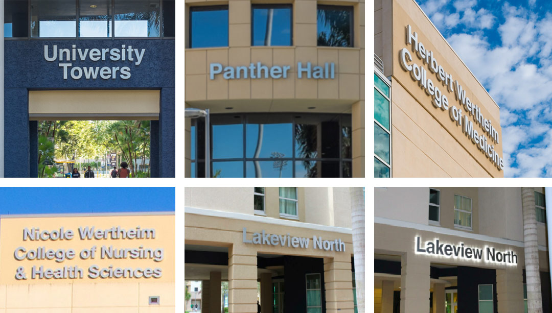
Exterior/Interior Building Signage Guidelines
There are various on- and off-campus signage options to support educational, cultural and informational efforts. Signs that do not meet these guidelines may be removed at the unit or office’s expense.
- Must use Helvetica Neue 75 Bold
- All exterior and interior signage must be title case.
- Signage must feature ½” thick aluminum letters, 12” in height (back-lit optional).

Billboards
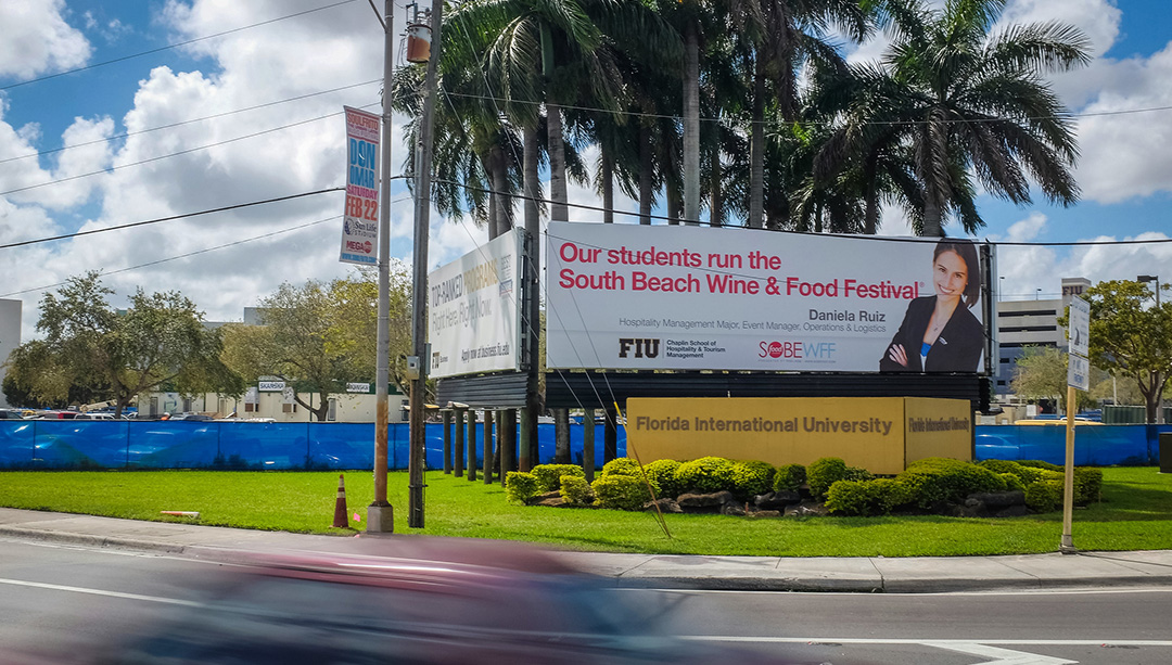
Strategic Communications manages the three on-campus billboards at the corner of 107th Ave. and 8th St. These billboards are used for university-wide messaging and are available to units and colleges for a fee.
Before creating a billboard, know your audience and campaign goal. Keep the message short and include a clear call to action, such as a phone number or website. Use a headline and, if needed, a sub-headline, adjusting font sizes and colors to enhance readability.
On-Campus Billboard Specifications:
- Dimensions: 40’ x 12’
- File Format: Hi-res PDF (Press Quality)

Digital Displays
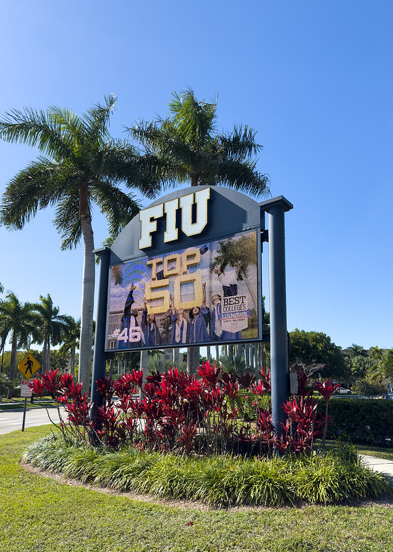
Electronic Message Boards (EMB) highlight university-wide events, rankings and strategic initiatives. They showcase sports, arts, performances, university accolades and key programs aligned with the university’s mission.
EMBs are located at key entrances to Modesto A. Maidique Campus:
- 17th St. and 117th Ave.
- 8th St. and 112th Ave.
- 16th St. and 107th Ave.
EMB Guidelines
- Use a headline and sub-headline if needed.
- Include a clear call-to-action (phone number or website). Use short URLs.
- Keep your message within 150 characters.
- Use at least 42pt font or at 72dpi Photoshop.
- List the event date, time, and location. All event-related EMB flyers must be on the FIU Calendar.
- EMB dimensions: 1280px x 720px.
- Submit static flyers as hi-res JPGs and video flyers as MP4 files.

Floor Stickers
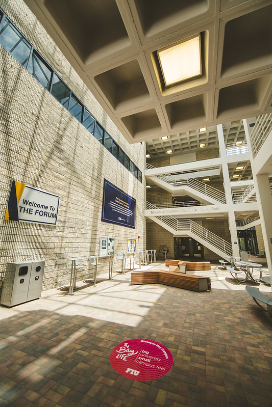
Floor stickers are a great way for units to share messages with the university community. However, it's important to maintain the brand’s aesthetic and place stickers only in approved locations. While there is no central system for placement or removal, all designs and content must be approved by Strategic Communications.
Floor Stickers Guidelines
- Stickers must be at least 24” in diameter or 24” x 24”.
- Stickers can stay up for up to one month. Include a posting date and contact email (bottom left or right).
- Stickers should only be placed in approved areas, unless approved by Strategic Communications.
- Placement is first-come, first-served, with a maximum of three stickers next to each other.
- Temporary wayfinding stickers may get approval for size changes if requested.
- The unit placing the stickers is responsible for both putting them up and taking them down. Stickers must show an expiration date (bottom right corner).
Strategic Communications may remove expired stickers but can’t guarantee stickers stay up until they expire.
