Primary Fonts
Proxima Nova is the official type family for FIU. It’s an organic, humanist modern sans serif font optimized for screens and print media.
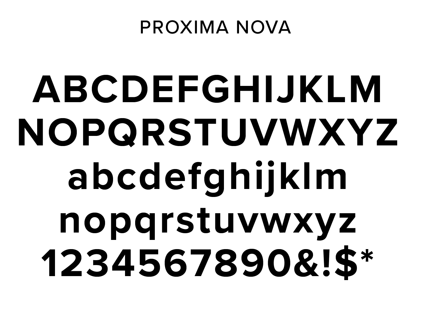
Proxima Nova
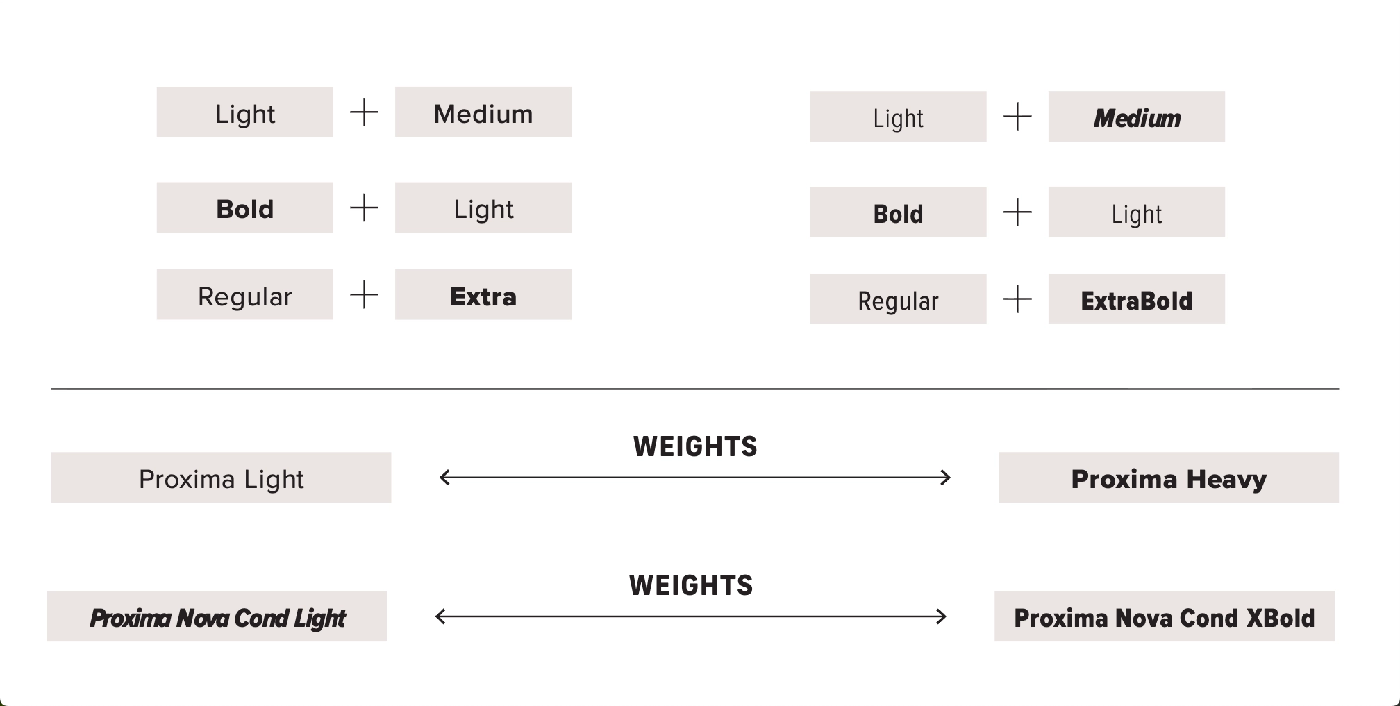
The FIU brand uses all of Proxima Nova’s type weights. For optimal use, it is recommended to use contrasting weight combinations, reserving the heavier variations to bring emphasis to headlines or keywords within the copy
Headlines in Proxima Nova are heavier in weight than the body copy. Preferably they are set in AllCaps, with wider tracking (between 10 and 30).
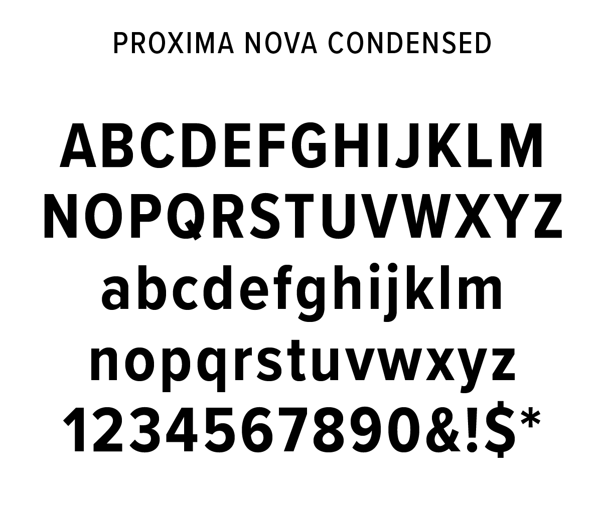
Proxima Nova Condensed
The Proxima Nova Condensed could be use in constrained spaces like digital screens, videos and print too. Headlines in Proxima Nova condensed are heavier in weight than the body copy.
Font Weight Combination Examples
Accent Font
Furore
Furore is the official decorative accent font for FIU. It’s a geometric sans serif font with limited glyphs and special characters. It does not include lowercase letter forms.
The FIU brand uses Furore in short sentences (no more than 5 words), to highlight keywords or for decorative numbers. It is paired with Proxima Nova for longer headlines and copy.
The All-Caps set is used with wider tracking (between 100 and 250).

Use Examples
![]()