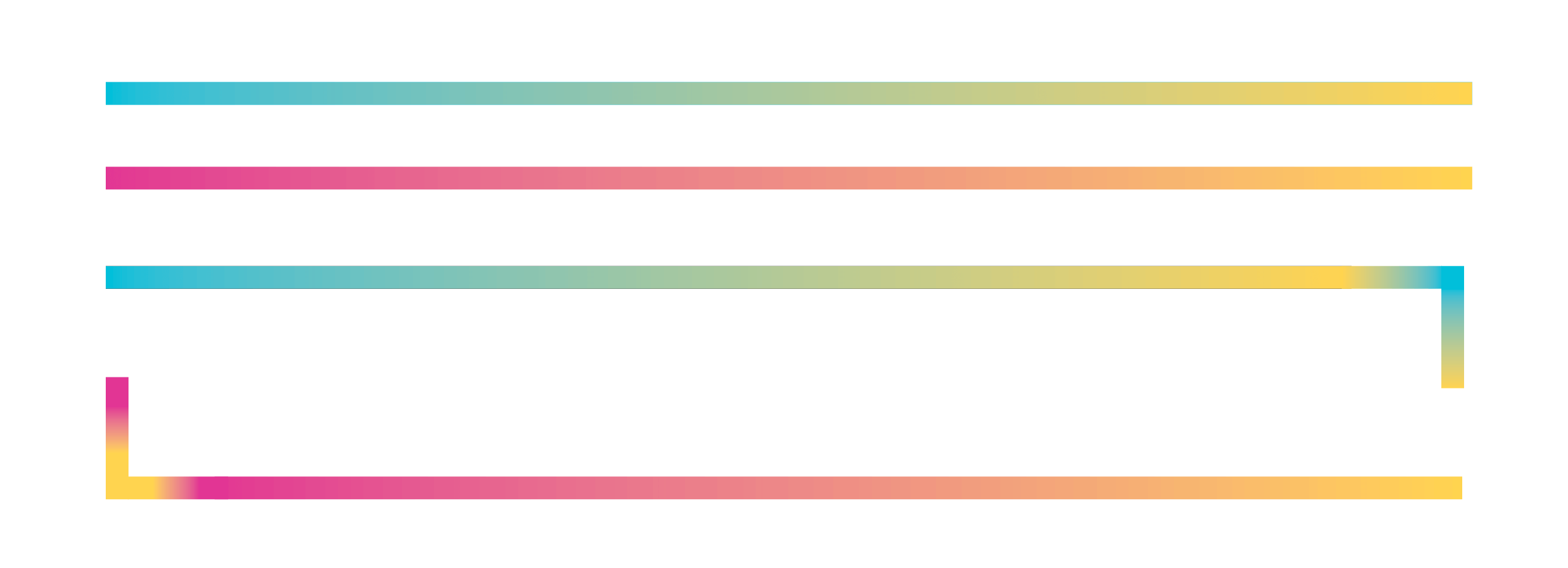
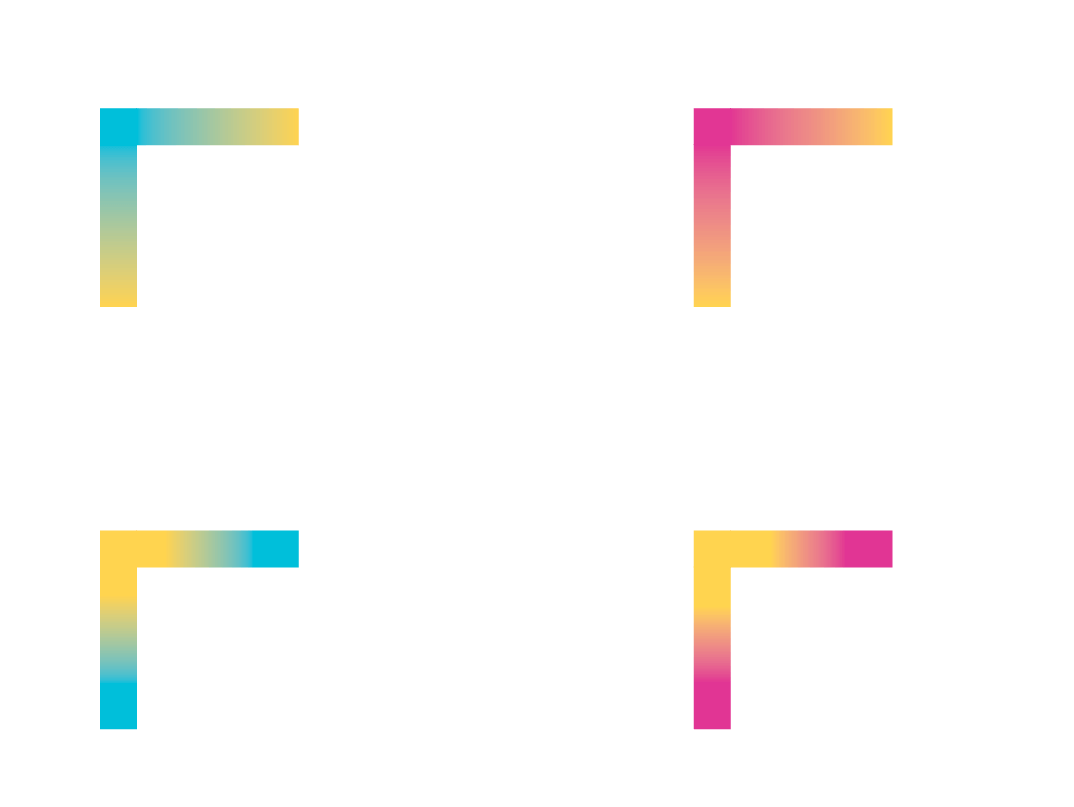
Various design elements are used throughout the FIU brand. To keep it clean, legible and consistent, these elements should be used sparingly. When using these elements, be sure to allow for white space and a clear hierarchy of information. Never allow graphic elements to overpower the messages we are communicating.

Energy lines 

These gradient lines represent FIU’s empowering force that energizes the world. They live on the edges of shapes or can be used as a frame. For more details on measurements, please see the section below.  


Energy lines don’ts

Do not use more than two lines per shape. Energy lines should move the eye around the composition rather than being a solid frame. Four shapes can be used on the corners of an image.

Gradient colors should always be seamless.  Make sure to connect the colors at the corners.

Shapes

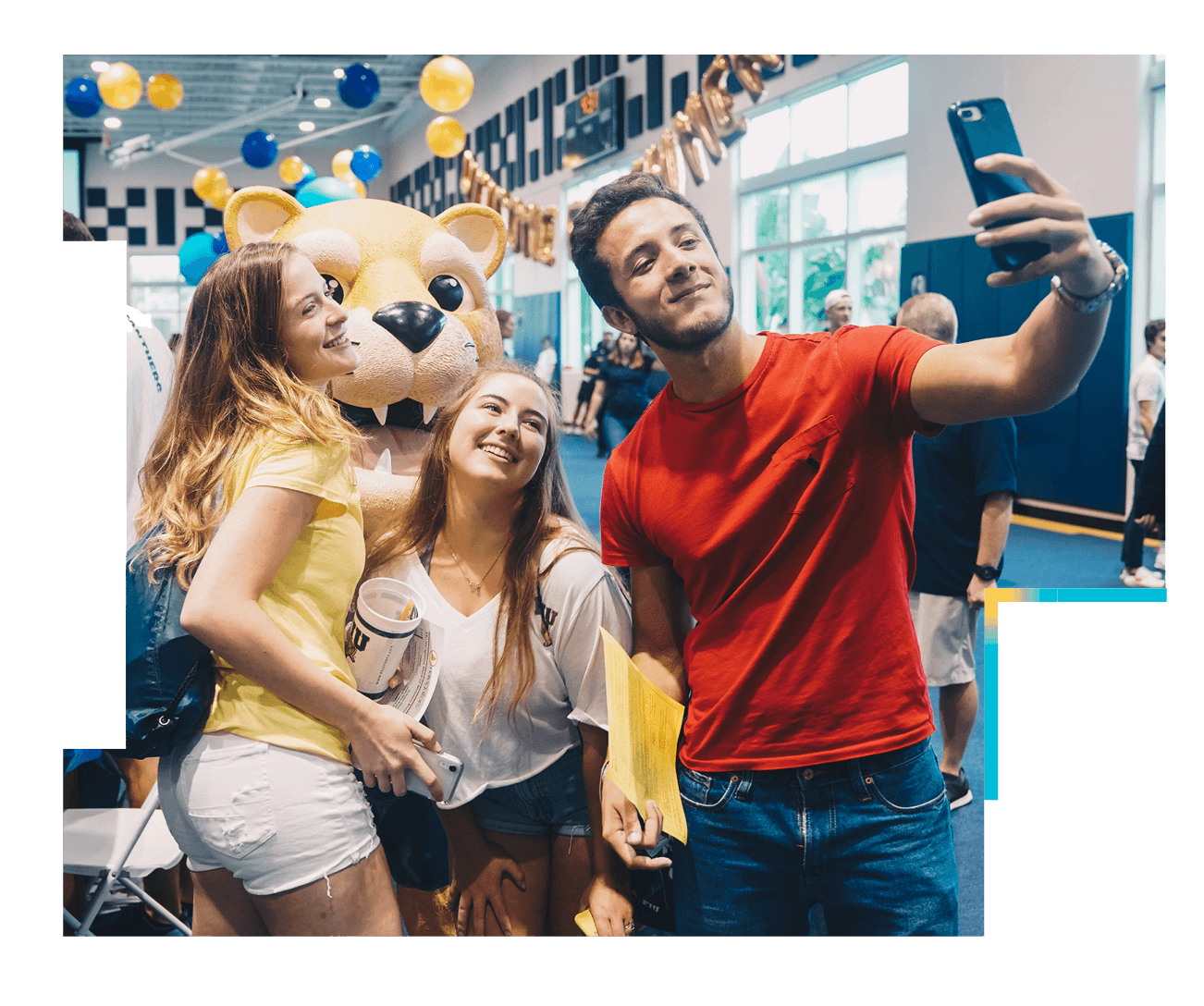
Shapes can be used as a container for imagery as well as a textural element when used as a pattern. Though all shapes are different, there are three moves that define a shape in this brand. Each can be used in any combination to give you your desired shape.

Indents

Concave part of the shape that can be used as a style when short or used to hold information or logos when long.

Tails

Extremity of the shape that can be used to add small, stylistic touches when short; and to add dramatic but subtle touches when elongated.

Steps

A move that can give more style to the shape. Can also help with masking negative space when holding images.

Combo

Use any combination of moves as you like. Use your imagery and the shape of your copy block as a guide when creating shapes.

Shapes dont’s

Do not use round or elliptical forms to build shapes.

While shapes can have several elements to them, refrain from creating shapes that become too complex.

Corners 

Energy lines are also used throughout the brand as corners. They can be used in pairs or in all four corners.

It is important that corners are consistent in size (width and length) in the same creative execution to avoid inconsistencies and uneven design elements. The width and length will depend on the format and size of the creative asset as well as the content density. Please see the following section for more information about specific measurements.

Note: Approved corners are provided in the toolkit. Please refrain from recreating different versions.

These are examples of creative executions using corners.


Corners dont’s

corner-dont-1.png
Do not recreate new gradient effects.

corner-dont-2.png

Do not use a different length and width for one of the sides. Both sides should be consistent in length and width.

corner-dont-3.png
Gradient colors should always be seamless. Make sure to connect the colors at the intersection. 
corner-dont-4.png
These types of gradients are not acceptable. The color should come from the center to the ends of the corner. 

Measurements for energy lines, corners and brackets

The following section includes guidelines for the measurements of the energy lines, corners and brackets. Use these guidelines as a starting point knowing that these may change and could be adapted based on your creative asset. For example, some creative executions may have more text and may need to have a thinner line. These should be used as a reference and starting point. Overall, the lines should be thin, and not compete with photography or other information.

Remember that all lines need to have the same width and length to achieve a consistent look in the same execution. 

Note: The print section includes CYMK colors. For all digital assets, HEX or RGB must be used.

  • Print Guidelines

    8.5 x 11” layout:

    • Make sure to maintain the width (shorter side) of the energy line between to 6 pt. to 10 pt.
    • The length (longer side) can be adjusted.

      11 x 17” layout:

    • Make sure to maintain the width (shorter side) of the energy line between 10 pt. to 14 pt.
    • The length (longer side) can be adjusted. energy-lines-guidelines-print2.png

      18 x 24” (poster) to 40 x 12” (billboard) layouts:

    • Make sure to maintain the width (shorter side) of the energy line to 24 pt.
    • The length (longer side) can be adjusted.
  • Social Media Guidelines

    General

    The thickness of the energy lines and corners should be 15px, regardless of the social media asset (i.e. square, Instagram story, etc.)

    Corners and energy lines

    Since the thickness of the energy lines and corners is 15px, each segment of the corner should be 108px to keep them in proportion. The length of the energy lines will vary based on the image. However, the thickness should remain the same (15px).

    fiu_social_4.png      fiu_social_5.png

    Download these social media templates here

    Download the social media corners here

  • Website & Eblast Guidelines

    General

    The thickness of the energy lines and corners should be 10px, regardless of screen size.

    Corners and energy lines

    Each segment of the corner should be 72px with the thickness of the energy line being 10px. The length of the energy lines will vary based on the image. However, the thickness should remain the same (10px).

    Brackets

    The outward segments of the brackets should be 72px and the height of the bracket will vary. The height should be proportionate to the content within the brackets. Thickness remains 10px as previously mentioned.

    The following guidelines were made with these screen sizes/media queries in mind:

    • Small – 320px
    • Medium – 640px
    • Large – 1024px
    • XLarge – 1200px
    • XXLarge – 1440px

    Notes:

    Eblasts can range from 500px – 640px in width. If they are created to be mobile-friendly the max width can also be from 500px – 640px. 

    Media queries may vary per developer, framework or template. Additionally, developers can make their own custom media queries.

Pattern

The pattern is composed of unique shapes and boxes that are connected by their sides and corners to create different mosaic patterns. The pattern can be used as a texture in large fields of negative space or as a background element. It can also be used to show multiple photos in a single layout.

Pattern don’ts

Do not run type over the pattern.

Do not use the pattern on top of imagery.


Do not use the pattern to crop an individual image.

Textured backgrounds

Textured backgrounds are made from solid colors with a subtle glow located on the corners. If using copy over the textured backgrounds, take care to avoid running type over the corner gradient sections, as it will create legibility issues.