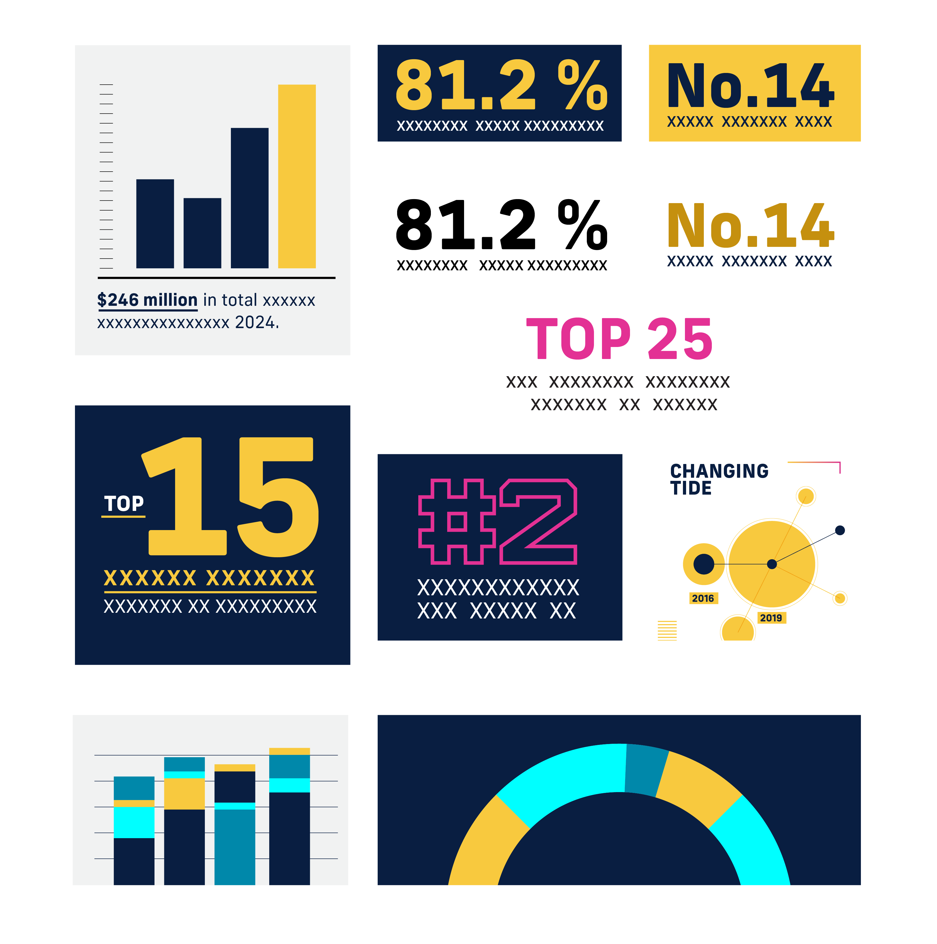
To showcase accomplishments, milestones or important data, the brand can use a formalized data visualization system.
- Use FIU colors to highlight the data point that is pertinent to the university.
- Use Furore’s number characters to create visual contrast.
- Use different levels of opacity of FIU Yellow to indicate levels of the same data point.
- When creating scatter-plots, use a subtle grid behind the dot plot to provide order.
- Use elementary shapes to indicate percentages, areas, amounts and other values. Use squares, circles, bar charts, wheel charts, etc.