Various design elements are used throughout the FIU brand. To keep it clean, legible and consistent, these elements should be used sparingly. When using these elements, be sure to allow for white space and a clear hierarchy of information. Never allow graphic elements to overpower the messages we are communicating.
Energy Lines
These energy lines represent FIU’s empowering force that energizes the world. They serve to punctuate graphic elements like photographs, shaded rectangles, borders of a media format and text underlines. The lines should be thin, and not compete with photography or other information when used as a frame. Energy lines are also used throughout the brand as corners, pointers and brackets.
Key takeaways
- Use one gradient type only for each composition or piece. Do not combine both types of gradients into a single piece.
- Use one or two energy lines on the entire layout.
- Stroke weight of the energy lines varies, depending on the scale of the piece.
- Gradient angle is adjusted to make the transition clearly visible.
- There are three types of gradient energy lines used for FIU. The colorways allowed are:
- Yellow to Cyan
- Yellow to Magenta
- Solid brand colors may be used for energy lines.
Examples
Energy Lines

Corners
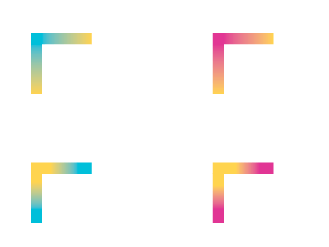
Brackets

Pointers

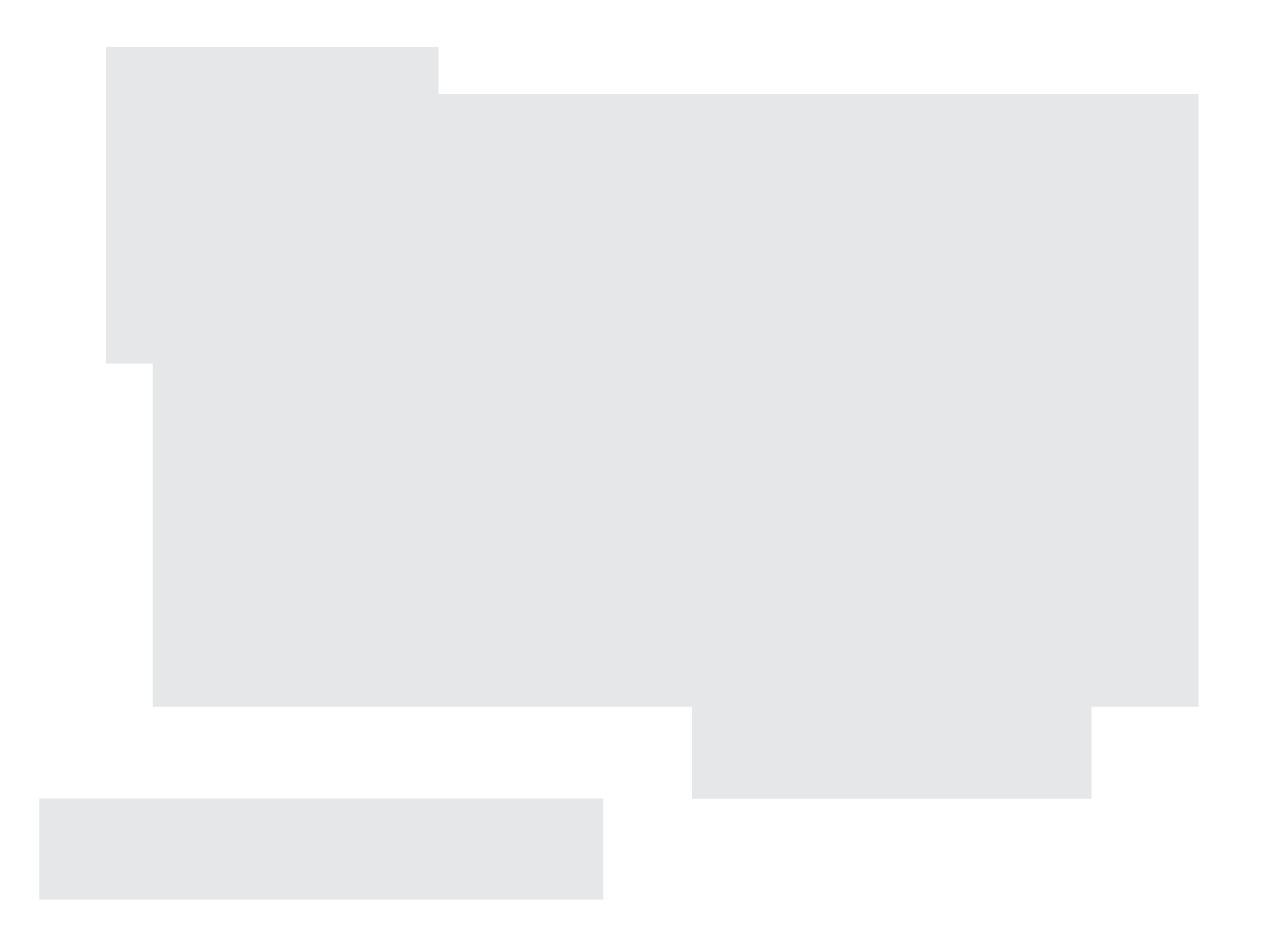
Geometric Shapes
Shapes can be used as a container for imagery or text as well as a textural element when used as a pattern. Though all shapes are different and modular, make sure to adhere to a grid. Each can be used in any combination to give you your desired shape block colors, overlapping blocks and photographs can lend additional flexibility to the visual representation of the brand.
Key takeaways
- Use the grid as a composition guide, and size graphic elements at different scales to add visual interest.
- Invisible grid overlay can be used as a guide for composition purposes.
- The added opacities of gradient blocks or colors provide a richer visual texture to gradient or solid color backgrounds.
- Use energy lines to connect elements or as a framing or accent device; refer to examples provided.
Examples
Text Container
Overlapping Blocks

Photo Container

Textural Pattern